Android'de yuvarlatılmış köşeli özel diyalog nasıl yapılır


133

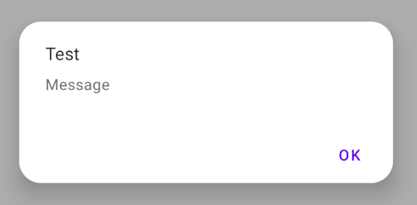
Yapmaya çalıştığım şey: android'de yuvarlatılmış köşeli özel bir diyalog oluşturmaya çalışıyorum.

Ne oluyor: Özel diyaloglar yapabiliyorum ama yuvarlatılmış köşeleri yok. Bir seçici eklemeyi denedim ama yine de yuvarlatılmış köşeler elde edemedim.

Aynı kodum aşağıdadır:


Java kodu:

private void launchDismissDlg() {

        dialog = new Dialog(getActivity(), android.R.style.Theme_Dialog);
        dialog.requestWindowFeature(Window.FEATURE_NO_TITLE);
        dialog.setContentView(R.layout.dlg_dismiss);
        dialog.setCanceledOnTouchOutside(true);

        Button btnReopenId = (Button) dialog.findViewById(R.id.btnReopenId);
        Button btnCancelId = (Button) dialog.findViewById(R.id.btnCancelId);

        btnReopenId.setOnClickListener(new OnClickListener() {
            @Override
            public void onClick(View v) {


            }
        });


        btnCancelId.setOnClickListener(new OnClickListener() {
            @Override
            public void onClick(View v) {


            }
        });
        dialog.setCanceledOnTouchOutside(false);
        dialog.getWindow().setSoftInputMode(WindowManager.LayoutParams.SOFT_INPUT_STATE_ALWAYS_HIDDEN);
        dialog.getWindow().setLayout(LayoutParams.MATCH_PARENT,LayoutParams.WRAP_CONTENT);
        dialog.show();

    }

xml kodu:

<?xml version="1.0" encoding="utf-8"?>
<LinearLayout xmlns:android="http://schemas.android.com/apk/res/android"
    android:layout_width="match_parent"
    android:layout_height="match_parent"
    android:background="@android:color/white"
    android:orientation="vertical" >

    <TableLayout
        android:layout_width="match_parent"
        android:layout_height="wrap_content" >

        <TableRow
            android:id="@+id/tableRow1"
            android:layout_width="match_parent"
            android:layout_height="wrap_content"
            android:layout_marginTop="20dp"
            android:gravity="center" >

            <TextView
                android:id="@+id/textView1"
                android:layout_width="wrap_content"
                android:layout_height="wrap_content"
                android:gravity="center"
                android:text="&quot;I WOULD LIKE TO DISMISS THE VENDOR&quot;"
                android:textColor="@color/col_dlg_blue_light"
                android:textSize="14sp"
                android:textStyle="bold" />
        </TableRow>

        <TableRow
            android:id="@+id/tableRow2"
            android:layout_width="match_parent"
            android:layout_height="wrap_content"
            android:layout_marginTop="5dp"
            android:gravity="center" >

            <TextView
                android:id="@+id/textView2"
                android:layout_width="wrap_content"
                android:layout_height="wrap_content"
                android:gravity="center"
                android:text="BECAUSE"
                android:textColor="@android:color/black"
                android:textStyle="bold" />
        </TableRow>


        <TableRow
            android:id="@+id/tableRow4"
            android:layout_width="match_parent"
            android:layout_height="wrap_content" >

            <Button
                android:id="@+id/btnReopenId"
                android:layout_width="0dp"
                android:layout_height="wrap_content"
                android:layout_weight="1"
                android:background="@color/col_dlg_green_light"
                android:text="REOPEN"
                android:padding="5dp"
                android:textSize="14sp"
                android:textColor="@android:color/white"
                android:textStyle="bold" />

            <Button
                android:id="@+id/btnCancelId"
                android:layout_width="0dp"
                android:layout_height="wrap_content"
                android:layout_weight="1"
                android:background="@color/col_dlg_pink_light"
                android:text="CANCEL"
                android:padding="5dp"
                android:textSize="14sp"
                android:textColor="@android:color/white"
                android:textStyle="bold" />
        </TableRow>
    </TableLayout>

</LinearLayout>

Yüzen menüden mi bahsediyorsun?
Apurva

@Apurva ... kayan menü kullanmadım ... ama bir uyarı iletişim kutusundan bahsediyorum (özel)
Devrath

Yüzen menüyü soruyordum çünkü sadece bunda yuvarlak köşeli bir açılır pencere gördüm. Yuvarlatılmış köşeli diyalog görmedim.
Apurva

Yanıtlar:


351

Çizilebilir bir XML oluşturun, diyalog_bg.xml

<?xml version="1.0" encoding="utf-8"?>
<shape xmlns:android="http://schemas.android.com/apk/res/android">
    <solid
        android:color="@color/white"/>
    <corners
        android:radius="30dp" />
    <padding
        android:left="10dp"
        android:top="10dp"
        android:right="10dp"
        android:bottom="10dp" />
</shape>

xml düzeninizde arka plan olarak ayarlayın

android:background="@drawable/dialog_bg"

Android, diyalog mizanpajınızı özel mizanpajınızdaki köşeleri gizleyen bir kök görünümün içine koyduğundan, diyaloğun kök görünümünün arka planını şeffaf yapın.

dialog.getWindow().setBackgroundDrawable(new ColorDrawable(Color.TRANSPARENT));

1
Bu yaklaşımla ilgili sorun, düğmenin arka planının da şeffaf olmasıdır.
Henrique de Sousa

46
dialog.getWindow().setBackgroundDrawable(new ColorDrawable(Color.TRANSPARENT));diğer SO konularının çoğunda yanlış olan şeydir! +1
Randika Vishman

Arkaplan ŞEFFAF görünmüyor lütfen bana yardım edin efendim ,,, @ koma yip
Gowthaman M

3
setBackgroundDrawablekullanımdan kaldırılmış gibi görünüyor ... buna alternatif var mı?
DarkCygnus

3
Ekle dialog.getWindow().setBackgroundDrawable(new ColorDrawable(Color.TRANSPARENT));öncesetContentView
Ravi Vaniya

23

Aşağıdakileri yapmanız gerekir:

  • Diyaloğun arka planı için yuvarlatılmış köşelere sahip bir arka plan oluşturun:

    <?xml version="1.0" encoding="utf-8"?>
    <shape xmlns:android="http://schemas.android.com/apk/res/android"
    android:shape="rectangle" >
    
        <solid android:color="#fff" />
    
        <corners
            android:bottomLeftRadius="8dp"
            android:bottomRightRadius="8dp"
            android:topLeftRadius="8dp"
            android:topRightRadius="8dp" />
    
    </shape>
  • Şimdi Dialog'unuzun XML dosyasında kök mizanpajında ​​gerekli kenar boşluğuyla bu arka planı kullanın:

    android:layout_marginLeft="20dip"
    android:layout_marginRight="20dip"
    android:background="@drawable/dialog_background"
  • son olarak java bölümünde şunu yapmanız gerekir:

    dialog.requestWindowFeature(Window.FEATURE_NO_TITLE);
    dialog.setContentView(layoutResId);
    View v = getWindow().getDecorView();
    v.setBackgroundResource(android.R.color.transparent);

Bu benim için mükemmel çalışıyor.


1
tüm köşeler için aynı değeri kullanmak istiyorsanız, kullanmalısınız <corners android:radius="8dp"/>, aksi takdirde işleme sorunları
Mehran

1
@Mehran iyi nokta. Bunu belirttiğiniz için teşekkürler. Bu bilginin kaynağını da paylaşabilir misin?
SMR

@SMR Path.isConvex is not supportedBu, tüm köşeler için aynı değere sahip bir şekil kullanırsanız genellikle mizanpajınızda aldığınız uyarıdır. stackoverflow.com/q/34736981/6605907
Mehran

17

dialog.getWindow().setBackgroundDrawable(new ColorDrawable(Color.TRANSPARENT));

bu benim için çalışıyor


13

dimen.xml

<?xml version="1.0" encoding="utf-8"?>
<resources>

    <integer name="weight">1</integer>

    <dimen name="dialog_top_radius">21dp</dimen>

    <dimen name="textview_dialog_head_min_height">50dp</dimen>
    <dimen name="textview_dialog_drawable_padding">5dp</dimen>

    <dimen name="button_dialog_layout_margin">3dp</dimen>


</resources>

styles.xml

<style name="TextView.Dialog">
        <item name="android:paddingLeft">@dimen/dimen_size</item>
        <item name="android:paddingRight">@dimen/dimen_size</item>
        <item name="android:gravity">center_vertical</item>
        <item name="android:textColor">@color/black</item>
    </style>

    <style name="TextView.Dialog.Head">
        <item name="android:minHeight">@dimen/textview_dialog_head_min_height</item>
        <item name="android:textColor">@color/white</item>
        <item name="android:background">@drawable/dialog_title_style</item>
        <item name="android:drawablePadding">@dimen/textview_dialog_drawable_padding</item>
    </style>

    <style name="TextView.Dialog.Text">
        <item name="android:textAppearance">@style/Font.Medium.16</item>
    </style>

    <style name="Button" parent="Base.Widget.AppCompat.Button">
        <item name="android:layout_height">@dimen/button_min_height</item>
        <item name="android:layout_width">match_parent</item>
        <item name="android:textColor">@color/white</item>
        <item name="android:gravity">center</item>
        <item name="android:textAppearance">@style/Font.Medium.20</item>
    </style>

 <style name="Button.Dialog">
        <item name="android:layout_weight">@integer/weight</item>
        <item name="android:layout_margin">@dimen/button_dialog_layout_margin</item>
    </style>

    <style name="Button.Dialog.Middle">
        <item name="android:background">@drawable/button_primary_selector</item>
    </style>

dialog_title_style.xml

<?xml version="1.0" encoding="utf-8"?>
<shape xmlns:android="http://schemas.android.com/apk/res/android"
    android:shape="rectangle">

    <gradient
        android:angle="270"
        android:endColor="@color/primaryDark"
        android:startColor="@color/primaryDark" />

    <corners
        android:topLeftRadius="@dimen/dialog_top_radius"
        android:topRightRadius="@dimen/dialog_top_radius" />

</shape>

dialog_background.xml

<?xml version="1.0" encoding="utf-8"?>
<shape xmlns:android="http://schemas.android.com/apk/res/android">
    <solid android:color="@color/backgroundDialog" />
    <corners
        android:topLeftRadius="@dimen/dialog_top_radius"
        android:topRightRadius="@dimen/dialog_top_radius" />
    <padding />
</shape>

dialog_one_button.xml

<?xml version="1.0" encoding="utf-8"?>
<LinearLayout xmlns:android="http://schemas.android.com/apk/res/android"
    android:layout_width="match_parent"
    android:layout_height="wrap_content"
    android:background="@drawable/dailog_background"
    android:orientation="vertical">

    <TextView
        android:id="@+id/dialogOneButtonTitle"
        style="@style/TextView.Dialog.Head"
        android:text="Process Completed" />

    <LinearLayout
        android:layout_width="match_parent"
        android:layout_height="wrap_content"
        android:layout_marginBottom="16dp"
        android:layout_marginLeft="16dp"
        android:layout_marginRight="16dp"
        android:orientation="vertical">

        <TextView
            android:id="@+id/dialogOneButtonText"
            style="@style/TextView.Dialog.Text"
            android:text="Return the main menu" />

        <LinearLayout
            android:layout_width="match_parent"
            android:layout_height="wrap_content"
            android:orientation="horizontal">

            <Button
                android:id="@+id/dialogOneButtonOkButton"
                style="@style/Button.Dialog.Middle"
                android:text="Ok" />

        </LinearLayout>

    </LinearLayout>

</LinearLayout>

OneButtonDialog.java

package com.example.sametoztoprak.concept.dialogs;

import android.app.Dialog;
import android.graphics.Color;
import android.graphics.drawable.ColorDrawable;
import android.os.Bundle;
import android.support.v7.app.AppCompatActivity;
import android.view.View;
import android.view.Window;
import android.widget.Button;
import android.widget.TextView;

import com.example.sametoztoprak.concept.R;
import com.example.sametoztoprak.concept.models.DialogFields;

/**
 * Created by sametoztoprak on 26/09/2017.
 */

public class OneButtonDialog extends Dialog implements View.OnClickListener {

    private static OneButtonDialog oneButtonDialog;
    private static DialogFields dialogFields;

    private Button dialogOneButtonOkButton;
    private TextView dialogOneButtonText;
    private TextView dialogOneButtonTitle;

    public OneButtonDialog(AppCompatActivity activity) {
        super(activity);
    }

    public static OneButtonDialog getInstance(AppCompatActivity activity, DialogFields dialogFields) {
        OneButtonDialog.dialogFields = dialogFields;
        return oneButtonDialog = (oneButtonDialog == null) ? new OneButtonDialog(activity) : oneButtonDialog;
    }

    @Override
    protected void onCreate(Bundle savedInstanceState) {
        super.onCreate(savedInstanceState);
        requestWindowFeature(Window.FEATURE_NO_TITLE);
        setContentView(R.layout.dialog_one_button);
        getWindow().setBackgroundDrawable(new ColorDrawable(Color.TRANSPARENT));

        dialogOneButtonTitle = (TextView) findViewById(R.id.dialogOneButtonTitle);
        dialogOneButtonText = (TextView) findViewById(R.id.dialogOneButtonText);
        dialogOneButtonOkButton = (Button) findViewById(R.id.dialogOneButtonOkButton);

        dialogOneButtonOkButton.setOnClickListener(this);
    }

    @Override
    protected void onStart() {
        super.onStart();
        dialogOneButtonTitle.setText(dialogFields.getTitle());
        dialogOneButtonText.setText(dialogFields.getText());
        dialogOneButtonOkButton.setText(dialogFields.getOneButton());
    }

    @Override
    public void onClick(View v) {
        switch (v.getId()) {
            case R.id.dialogOneButtonOkButton:

                break;
            default:
                break;
        }
        dismiss();
    }
}

görüntü açıklamasını buraya girin


10

Bir arka plan çekilebilir olmadan yeni bir yol yaptım, ebeveyn olarak CardView'a sahip olmasını sağlamak ve ona bir vermek app:cardCornerRadius="20dp"ve ardından bunu java sınıfına eklemek.dialog.getWindow().setBackgroundDrawable(new ColorDrawable(Color.TRANSPARENT));

Bunu yapmanın başka bir yolu.


9

Eğer kullanırsanız Malzeme Bileşenleri :

CustomDialog.kt

class CustomDialog: DialogFragment() {

    override fun getTheme() = R.style.RoundedCornersDialog

}

styles.xml

<style name="RoundedCornersDialog" parent="Theme.MaterialComponents.Dialog">
    <item name="dialogCornerRadius">dimen</item>
</style>

Benim için çözüm buydu, teşekkürler! Benim durumuma metin ve arka plan rengi ekledim: <style name = "RoundedCornersDialog" parent = "Theme.MaterialComponents.Dialog"> <item name = "dialogCornerRadius"> 15dp </item> <item name = "android: background" > @ color / white </item> <item name = "android: textColor"> @ color / black </item> </style>
fvaldivia

6

Arka plan için şekli kullanabilirsiniz.

<shape xmlns:android="http://schemas.android.com/apk/res/android"
android:shape="rectangle">
<solid android:color="@android:color/transparent"/>
<corners android:radius="10dp" />
<padding android:left="10dp" android:right="10dp"/>
</shape>

Bir göz bu detaylar için.


6

en basit yol kullanmaktır

CardView ve kartı: cardCornerRadius

<?xml version="1.0" encoding="utf-8"?>
<android.support.v7.widget.CardView 
 xmlns:android="http://schemas.android.com/apk/res/android"
 xmlns:card="http://schemas.android.com/apk/res-auto"
 android:orientation="vertical"
 android:id="@+id/cardlist_item"
 android:layout_width="match_parent"
 android:layout_height="130dp"
 card:cardCornerRadius="40dp"
 android:layout_marginLeft="8dp"
 android:layout_marginRight="8dp"
 android:layout_marginTop="5dp"
 android:layout_marginBottom="5dp"
 android:background="@color/white">

  <RelativeLayout
    android:layout_width="match_parent"
    android:layout_height="match_parent"
    android:layout_margin="12sp"
    android:orientation="vertical"
    android:weightSum="1">
    </RelativeLayout>

</android.support.v7.widget.CardView>

Ve Diyaloğunuzu oluştururken

dialog.getWindow().setBackgroundDrawable(new ColorDrawable(Color.TRANSPARENT));

Bu çözüm CardView yükseklik gölge tam görüntülenmesine izin vermez
laszlo

5

Ayar

dialog.getWindow().setBackgroundDrawable(new ColorDrawable(Color.TRANSPARENT));

diyalogun gölge yapmasını engelleyecektir.

Çözüm kullanmaktır

dialog.getWindow().setBackgroundDrawableResource(R.drawable.dialog_rounded_background);

R.drawable.dialog_rounded_background nerede

<?xml version="1.0" encoding="utf-8"?>
<layer-list xmlns:android="http://schemas.android.com/apk/res/android" >
    <item>
        <shape android:shape="rectangle" android:padding="10dp">
            <solid
                android:color="@color/dialog_bg_color"/>
            <corners
                android:radius="30dp" />
        </shape>
    </item>

</layer-list>

1
API 27, Android 8.1 Oreo üzerinde çalışan en zarif ve basit çözüm.
ManuelTS

Hala Theme.AppCompat
barnacle.m

4

XML'de bir şeyler yapmaktan hoşlanan herkes için, özellikle iletişim kutularında gezinmek için Gezinme mimarisi bileşen eylemlerini kullanmanız durumunda

Kullanabilirsiniz:

<style name="DialogStyle" parent="ThemeOverlay.MaterialComponents.Dialog.Alert">

    <!-- dialog_background is drawable shape with corner radius -->
    <item name="android:background">@drawable/dialog_background</item>

    <item name="android:windowBackground">@android:color/transparent</item>
</style>

Bu harika bir kısa olan! (y)
HasH

4

Yuvarlak köşeli özel iletişim kutusu oluşturmak için MaterialAlertDialogBuilder'ı kullanabilirsiniz.

Öncelikle aşağıdaki gibi malzeme diyaloğu için bir stil oluşturun:

<style name="MyRounded.MaterialComponents.MaterialAlertDialog" parent="@style/ThemeOverlay.MaterialComponents.MaterialAlertDialog">
    <item name="shapeAppearanceOverlay">@style/ShapeAppearanceOverlay.App.CustomDialog.Rounded
    </item>
    <item name="colorSurface">@color/YOUR_COLOR</item>
</style>

<style name="ShapeAppearanceOverlay.App.CustomDialog.Rounded" parent="">
    <item name="cornerFamily">rounded</item>
    <item name="cornerSize">10dp</item>
</style>

daha sonra Java sınıfında aşağıdaki gibi bir Uyarı İletişim Kutusu nesnesi oluşturun:

AlertDialog alertDialog =  new MaterialAlertDialogBuilder(this,R.style.MyRounded_MaterialComponents_MaterialAlertDialog)  // for fragment you can use getActivity() instead of this 
                    .setView(R.layout.custom_layout) // custom layout is here 
                    .show();

            final EditText editText = alertDialog.findViewById(R.id.custom_layout_text);   // access to text view of custom layout         
            Button btn = alertDialog.findViewById(R.id.custom_layout_btn);

            btn.setOnClickListener(new View.OnClickListener() {
                @Override
                public void onClick(View v) {

                    Log.d(TAG, "onClick: " + editText.getText().toString());
                }
            });

Tüm yapmanız gereken bu.


en doğru şekilde, AlertDialog.Builder yerine MaterialAlertDialogBuilder'ı kullanmayı unutmayın
Zakhar Rodionov

bu harika tanklar
Gilian Marques

Diğer tüm cevaplar modası geçmiş ve belirsizdir, ancak bu en basit ve doğru olanıdır! Teşekkür ederim
hamza khan

4

Androidx kitaplığı ve Malzeme Bileşenleri Teması ile getTheme()yöntemi geçersiz kılabilirsiniz :

import androidx.fragment.app.DialogFragment

class RoundedDialog: DialogFragment() {

    override fun getTheme() = R.style.RoundedCornersDialog

    //....

}

ile:

<style name="RoundedCornersDialog" parent="@style/Theme.MaterialComponents.Dialog">
    <item name="dialogCornerRadius">16dp</item>
</style>

Veya MaterialAlertDialogBuilderMalzeme Bileşenleri Kitaplığında bulunanları kullanabilirsiniz:

import androidx.fragment.app.DialogFragment
import com.google.android.material.dialog.MaterialAlertDialogBuilder

class RoundedAlertDialog : DialogFragment() {

    //...

    override fun onCreateDialog(savedInstanceState: Bundle?): Dialog {
        return MaterialAlertDialogBuilder(requireActivity(), R.style.MaterialAlertDialog_rounded)
                .setTitle("Test")
                .setMessage("Message")
                .setPositiveButton("OK", null)
                .create()
    }

}

ile:

<style name="MaterialAlertDialog_rounded" parent="@style/ThemeOverlay.MaterialComponents.MaterialAlertDialog">
    <item name="shapeAppearanceOverlay">@style/DialogCorners</item>
</style>

<style name="DialogCorners">
    <item name="cornerFamily">rounded</item>
    <item name="cornerSize">16dp</item>
</style>

görüntü açıklamasını buraya girin

İhtiyacınız yoksa DialogFragmentsadece MaterialAlertDialogBuilder.


3

İletişim kutusunun köşe yarıçapını kontrol etmek ve yükseklik gölgesini korumak istiyorsanız tam çözüm burada.

iletişim:

class OptionsDialog: DialogFragment() {

override fun onCreateView(inflater: LayoutInflater, container: ViewGroup, savedInstanceState: Bundle?): View {
    dialog?.window?.setBackgroundDrawable(ColorDrawable(Color.TRANSPARENT))
    return inflater.inflate(R.layout.dialog_options, container)
}

}

dialog_options.xml düzeni:

<FrameLayout xmlns:android="http://schemas.android.com/apk/res/android"
xmlns:app="http://schemas.android.com/apk/res-auto"
android:layout_width="wrap_content"
android:layout_height="wrap_content">

<androidx.cardview.widget.CardView
    android:layout_width="wrap_content"
    android:layout_height="wrap_content"
    android:layout_margin="40dp"
    app:cardElevation="20dp"
    app:cardCornerRadius="12dp">

    <androidx.constraintlayout.widget.ConstraintLayout
        id="@+id/actual_content_goes_here"
        android:layout_width="wrap_content"
        android:layout_height="wrap_content">
    </androidx.constraintlayout.widget.ConstraintLayout>

</androidx.cardview.widget.CardView>
</FrameLayout>

Anahtar, CardView'ü başka bir ViewGroup (burada FrameLayout) ile sarmak ve yükseklik gölgesi için alan oluşturmak üzere kenar boşluklarını ayarlamaktır.


3

Kotlin'de , window?.setBackgroundDrawable(ColorDrawable(Color.TRANSPARENT))önemli bir satır olan DoubleButtonDialog.Java sınıfını kullanıyorum

class DoubleButtonDialog(context: Context) : Dialog(context, R.style.DialogTheme) {

    private var cancelableDialog: Boolean = true
    private var titleDialog: String? = null
    private var messageDialog: String? = null
    private var leftButtonDialog: String = "Yes"
    //    private var rightButtonDialog: String? = null
    private var onClickListenerDialog: OnClickListener? = null

    override fun onCreate(savedInstanceState: Bundle?) {
        window?.setBackgroundDrawable(ColorDrawable(Color.TRANSPARENT))
        //requestWindowFeature(android.view.Window.FEATURE_NO_TITLE)
        setCancelable(cancelableDialog)
        setContentView(R.layout.dialog_double_button)
//        val btnNegative = findViewById<Button>(R.id.btnNegative)
//        btnNegative.visibility = View.GONE
//        if (rightButtonDialog != null) {
//            btnNegative.visibility = View.VISIBLE
//            btnNegative.text = rightButtonDialog
//            btnNegative.setOnClickListener {
//                dismiss()
//                onClickListenerDialog?.onClickCancel()
//            }
//        }
        val btnPositive = findViewById<Button>(R.id.btnPositive)
        btnPositive.text = leftButtonDialog
        btnPositive.setOnClickListener {
            onClickListenerDialog?.onClick()
            dismiss()
        }
        (findViewById<TextView>(R.id.title)).text = titleDialog
        (findViewById<TextView>(R.id.message)).text = messageDialog
        super.onCreate(savedInstanceState)
    }

    constructor(
        context: Context, cancelableDialog: Boolean, titleDialog: String?,
        messageDialog: String, leftButtonDialog: String, /*rightButtonDialog: String?,*/
        onClickListenerDialog: OnClickListener
    ) : this(context) {
        this.cancelableDialog = cancelableDialog
        this.titleDialog = titleDialog
        this.messageDialog = messageDialog
        this.leftButtonDialog = leftButtonDialog
//        this.rightButtonDialog = rightButtonDialog
        this.onClickListenerDialog = onClickListenerDialog
    }
}


interface OnClickListener {
    //    fun onClickCancel()
    fun onClick()
}

Düzende bir dialog_double_button.xml oluşturabiliriz

    <?xml version="1.0" encoding="utf-8"?>
    <LinearLayout xmlns:android="http://schemas.android.com/apk/res/android"
        xmlns:tools="http://schemas.android.com/tools"
        android:layout_width="fill_parent"
        android:layout_height="wrap_content"
        android:layout_gravity="center"
        android:layout_margin="@dimen/dimen_10"
        android:background="@drawable/bg_double_button"
        android:orientation="vertical"
        android:padding="@dimen/dimen_5">

        <TextView
            android:id="@+id/title"
            style="@style/TextViewStyle"
            android:layout_gravity="center_horizontal"
            android:layout_margin="@dimen/dimen_10"
            android:fontFamily="@font/campton_semi_bold"
            android:textColor="@color/red_dark4"
            android:textSize="@dimen/text_size_24"
            tools:text="@string/dial" />

        <TextView
            android:id="@+id/message"
            style="@style/TextViewStyle"
            android:layout_gravity="center_horizontal"
            android:layout_margin="@dimen/dimen_10"
            android:gravity="center"
            android:textColor="@color/semi_gray_2"
            tools:text="@string/diling_police_number" />

        <LinearLayout
            android:layout_width="match_parent"
            android:layout_height="wrap_content"
            android:layout_marginTop="@dimen/dimen_10"
            android:gravity="center"
        android:orientation="horizontal"
        android:padding="@dimen/dimen_5">

        <!--<Button
            android:id="@+id/btnNegative"
            style="@style/ButtonStyle"
            android:layout_width="0dp"
            android:layout_height="@dimen/dimen_40"
            android:layout_marginEnd="@dimen/dimen_10"
            android:layout_weight=".4"
            android:text="@string/cancel" />-->

        <Button
            android:id="@+id/btnPositive"
            style="@style/ButtonStyle"
            android:layout_width="wrap_content"
            android:layout_height="wrap_content"
            android:backgroundTint="@color/red_dark4"
            android:fontFamily="@font/campton_semi_bold"
            android:padding="@dimen/dimen_10"
            android:text="@string/proceed"
            android:textAllCaps="false"
            android:textColor="@color/white"
            android:textSize="@dimen/text_size_20" />
    </LinearLayout>
</LinearLayout>

daha sonra kullanmak drawable.xml olarak

<?xml version="1.0" encoding="utf-8"?>
<shape xmlns:android="http://schemas.android.com/apk/res/android">
    <solid
        android:color="@color/white"/>
    <corners
        android:radius="@dimen/dimen_10" />
    <padding
        android:left="@dimen/dimen_10"
        android:top="@dimen/dimen_10"
        android:right="@dimen/dimen_10"
        android:bottom="@dimen/dimen_10" />
</shape>

3

API seviyesi için> = 28 kullanılabilir özellik android:dialogCornerRadius. Önceki API sürümlerini desteklemek için kullanılması gerekir

<style name="RoundedDialog" parent="Theme.AppCompat.Light.Dialog.Alert">
        <item name="android:windowBackground">@drawable/dialog_bg</item>
    </style>

dialog_bg.xml nerede

<?xml version="1.0" encoding="utf-8"?>
<layer-list xmlns:android="http://schemas.android.com/apk/res/android">
    <item >
        <shape >
            <solid android:color="@android:color/transparent" />
        </shape>
    </item>
    <item
        android:left="16dp"
        android:right="16dp">
        <shape>
            <solid
                android:color="@color/white"/>
            <corners
                android:radius="8dp" />

            <padding
                android:left="16dp"
                android:right="16dp" />
        </shape>
    </item>
</layer-list>

Katman listesi / şeffaf şekil nedir?
Ixx
Sitemizi kullandığınızda şunları okuyup anladığınızı kabul etmiş olursunuz: Çerez Politikası ve Gizlilik Politikası.
Licensed under cc by-sa 3.0 with attribution required.